Built your avionics yet? Soldering complete, software written, interface bugs worked out? OK, I admit these questions don’t pertain to 99%-plus of pilots building airplanes who select their instruments from catalogs, web sites and airshow hawkers. Hey, that’s what’s available.
Unless you’re skilled at chip design, board etching, bus protocols and other nifty-sounding mystery e-words, you’ll probably rely on the really smart people who have figured out how to think in ones and zeros who have already done the hard part. All you have to do is pick one or more of the many instrument offerings.
Actually, instrument is too singular a word, since these gizmos usually incorporate a bevy of instrumentation. That conglomeration of bells and whistles packaged into a highly-integrated multi-function device may make it very capable, but can you use it without first going to school to learn how?
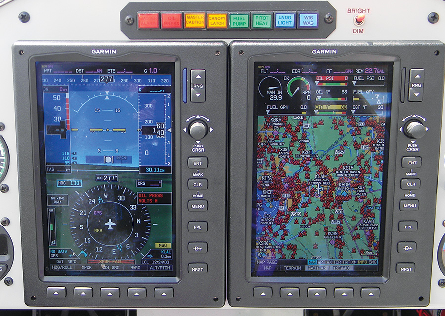
Garmin gets generally high marks for its human interface design, at least partially because it has retained certain basic operating logic features for two decades.
It’s On You
You may not design the features, screen icons or soft key options, but you’re the one who has to use them. Ideally, every feature would be obvious, and exploiting the system’s capabilities would be intuitive for anyone with a pilot’s license. Reality paints a different picture, so let’s raise a consideration or two when shopping for your whiz-bang panel widgets.
Some of the integrated devices available today pack a lot of different instruments and functions into a single display. Com, nav, GPS, moving map, weather, traffic, terrain, audio, engine parameters, and checklists might all be available. Since screen real estate is limited, you might have to navigate to another screen for the information you seek. How intuitive is that navigation? Is there a clearly-labeled button, or do you have to remember (or search if you’re like me) where the screen with that feature is? Every second spent with your eyes on the screen is a second not monitoring your other instruments or looking outside.
There’s something to be said for consistency as a product evolves. Unfortunately, that can go against product improvement if the company line is, “That’s what our customers are used to.” It would seem that improving the intuitiveness would be welcomed, but then again, I’m not a marketing guy.
I like my iPhone, except when it’s a sunny day. That screen that’s so vivid indoors and in subdued lighting washes out almost to the point of uselessness in direct sunlight. Good thing it’s just a phone and not a primary flight display (PFD). Make sure the panel device you select is readable in all light conditions before you shell out more of that over-budget money to purchase it. Besides the effect of ambient lighting on readability, can the screen brightness of the device be controlled with a master dimmer along with the rest of your panel, or will you be OK with the consequent extra knob twists or auto-dimming feature? How about glare from your copilot’s white shirt? Maybe fingerprints obscure the display when the light hits them just right. Do the colors remain faithful when the screen is dimmed, or do they fade toward grey shades?
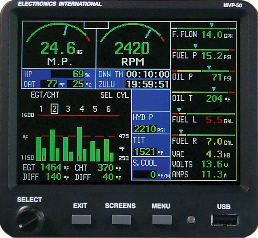
One advantage of electronic displays is that they can either mimic analog gauges or present values in bar-graph form, often at the whim of the user.
Colors and Fonts
Colors are important. In the certified world of aviation, there are three colors that are reserved for specific reasons. Red is for warning, a condition that the pilot needs to be aware of immediately and probably take action to avoid really bad things happening if they haven’t already, such as low oil pressure or loss of attitude information. Amber or yellow is for a caution situation where the pilot needs to be informed and might need to take some action because of the situation like low fuel or the loss of one attitude source while the remaining source remains functional.
Green generally signifies safe operation. Using green for information that can never go amber or red is traditional among some avionics manufacturers, but it may not be the best design. Green oil pressure allows the pilot to quickly ascertain it’s where it should be. Green “ON” annunciations merely convey an activated feature, and green numbers might be used to indicate the active com frequency, but neither indicates safe operation. Cyan or white might be better choices here.
So how much non-warning red and non-caution amber is used on the display you’re contemplating? They may be used in icons or soft key labels or company logos, but the more these colors appear for normal conditions, the more desensitized the pilot becomes to seeing those warning and caution colors. Since the driving reason for having these colors is to grab the pilot’s attention, populating a screen with extraneous reds and ambers makes detection of an emerging problem less likely.
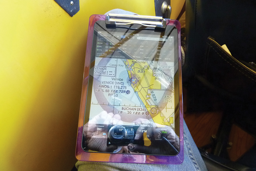
The iPad is almost a must-have cockpit accessory, but thanks to screen glare and compromised sunlight viewability, it’s not without its human factors warts.
OK, so you’re fine with the color schemes. How about the font size? What’s easily readable on the Internet page or directly in front of you on the demo unit at the airshow might not be so readable installed in your panel. How far over will you mount the display? Off-axis viewing can affect screen brightness and even color. I’ve seen the brown lower half of an attitude indicator glow bright red when viewed across the cockpit. Speaking of cross-cockpit viewing, how deeply is the screen set in its faceplate? Depending on its depth and how far across the panel you install it, the bezel might obscure information on the left side of the screen.
Round dials, tapes, digital—what’s your preference? Some devices combine gauge convention effectively to aid association for quicker comprehension. Maybe the manifold pressure and rpm are presented as analog dials with other engine health instruments showing as tapes or bars or simply digital. Sometimes the layout is well-conceived, and sometimes it seems the primary goal was to squeeze all that information onto a single screen wherever they happened to fit.
One of the best features of electronic displays is their ability to change from green to amber or red when an exceedance occurs. Some can even trigger a remote annunciation located directly in front of the pilot, which is handy if the device is on the other side of the cockpit outside the pilot’s normal scan. Even if the offending parameter is not displayed on the main screen, it can be continuously monitored and pop up when trouble occurs. Does it pop up? Or do you have to flip through e-pages to find what triggered the remote annunciation? What if a higher priority exceedance occurs after a lower one?
How many buttons and knobs ring the device’s bezel? Chances are good there aren’t enough to accommodate all the selectable features of the unit. Enter the soft key (soft label would be more appropriate) that performs whatever function the adjacent label on the screen says. Or does it?
On some units, the label indicates the current state, while on others the label indicates what will happen if you select that button. Can’t always tell just by looking at it, but you’ll figure it out eventually. Does ALT mean select this to dial in the altimeter setting, or select this to set the altitude bug? Is ALT also used to label the alternator’s output?
What’s the difference between CANCEL and BACK and EXIT? How about ENTER and ACCEPT? More important than the vernacular is whether the same function is assigned to the same button on every page. If ENTER changes from button to button depending on the screen, the likelihood of a misstep goes up.
Well designed multifunction devices can save weight, take up comparatively less panel space than individual instruments, can monitor and alert, assist with flight planning and fuel management and reduce pilot workload. That is, unless the screen goes black.

![]()
Ed Kolano is a test pilot who’s flown over 200 different aircraft types from ultralights to the B787. A CFI and former instructor at the U.S. Naval Test Pilot School, he’s a recipient of the Society of Experimental Test Pilots’ Spirit of Flight Award. His flight reviews, technical and educational articles have appeared in several U.S. and European magazines.


